Global climate change from a realistic, non-political point of view.
-Morgan Wright
CHAPTER 1. SEA LEVEL RISE
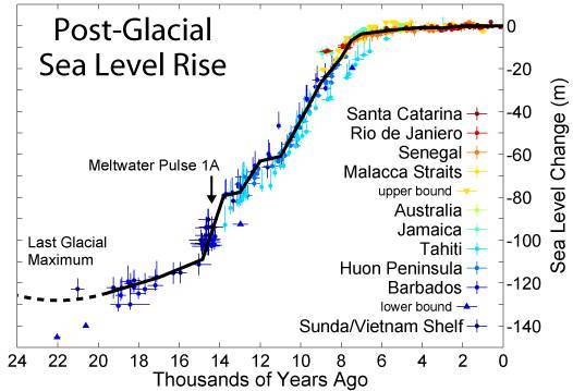
Figure 1a. Sea level rise for the past 20,000 years.
based on data from Fleming et al. 1998, Fleming 2000, & Milne et al. 2005
One can see from the graph that sea levels rose quickly as the ice-age glaciers melted, but, starting about 7,000 years ago, the sea level rise has been moderate.
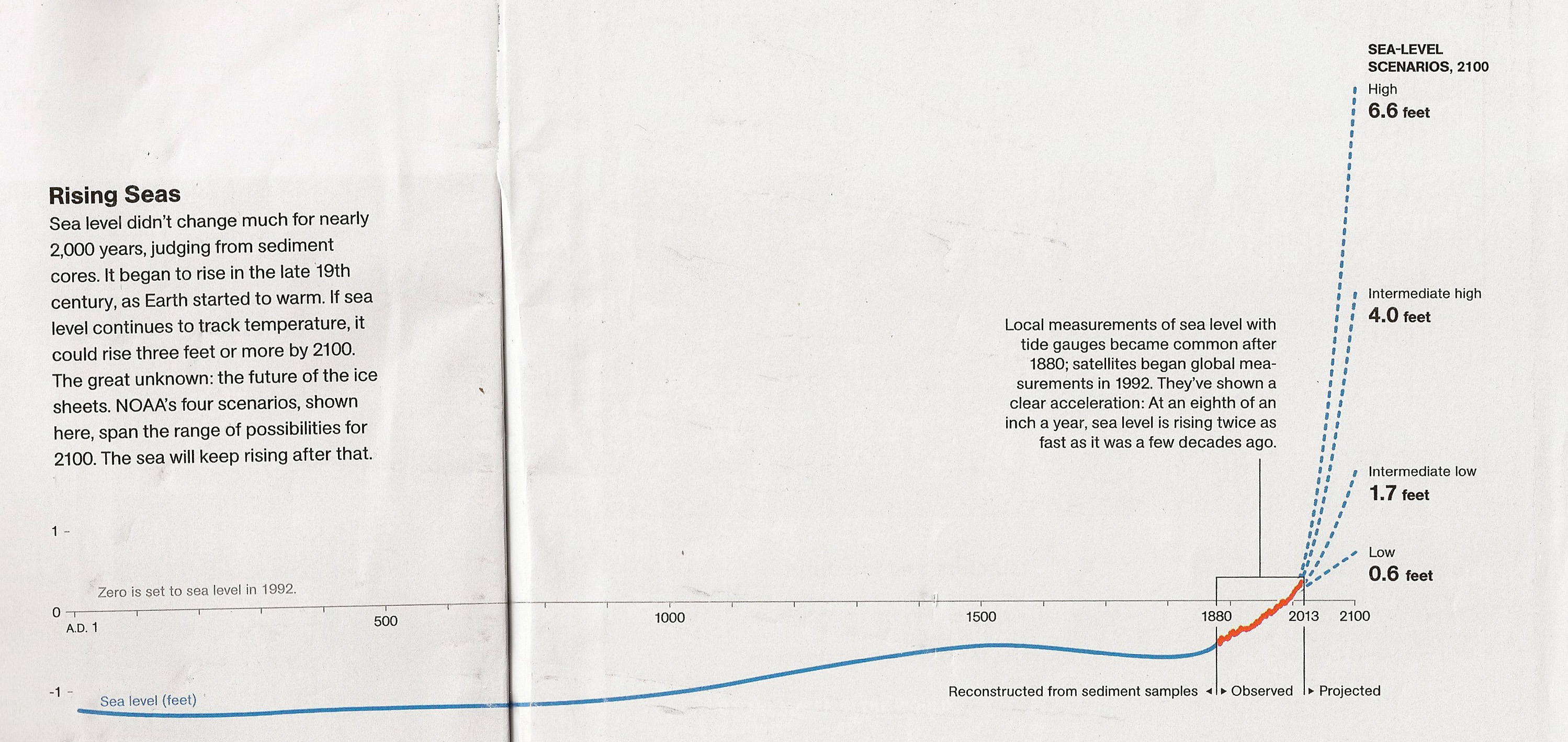
Figure 1b. Sea level rise at San Francisco for the past century and a half. It is linear, with no acceleration of rise. The rate is a constant 201 mm (about 8 inches) per century. Data are from NOAA (the US government's National Oceanic and Atmospheric Administration).
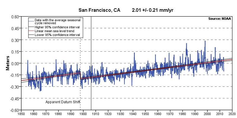
Figure 1c. NOAA data for New York City's battery (southern tip of Manhattan). You will see a constant linear rate of 277 mm or 11 inches per century.
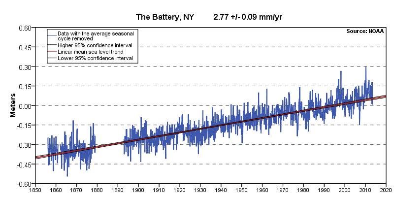
The rate is different in New York from San Francisco because of rising and falling of continental shorelines over time. We chose SF and NYC because the data go back to the 1850's, but at all locations the sea level data reveal linear trends. Other locations don't have such long histories, but can be browsed by the reader by clicking the link below. They show different rates, depending on what part of North America the measurements were taken. In Alaska, the sea levels are actually falling due to rebound from the previous ice age. Honolulu shows interesting data as well, since Hawaii is not part of the North American continental plate. It is a slower rise, but is linear, as usual.
(click link for more coastal locations). http://tidesandcurrents.noaa.gov/sltrends/sltrends_station.shtml?stnid=9414290
Please notice that the rate of rise has not increased in recent decades, in spite of the great increase in CO2 during that time due to human activity. If such activity played an appreciable part in increasing sea levels, the graph would show an upward curve (acceleration) starting in the mid 20th century when anthropogenic CO2 rise began in earnest. But the rise is a straight line without such a curve, or "hockey stick." The reason there is no such curve will be seen later in the paper. The general trend of 7 to 12 inches per century is due to a global warming period that started over 200 years ago, as we will see in figure 3b. below.
The sea level rise is due in part to the warming of the oceans, that is, the oceans are expanding like a thermometer. Some people believe that this is due to the CO2 rise in the last half of the 20th century. Publications supporting this belief only show charts starting in the middle of the 20th century, hiding the earlier rise. This is deceptive on their parts. If global warming were caused by CO2 changes in the 20th century, there would be a lower rise, or no rise, in sea level before the mid-20th century. But the rise was just as strong as it is now, and there is no acceleration of rise in recent decades, which these charts clearly demonstrate. Some scientists, however, continue to claim there is, but are unable to show it scientifically. Some show it fraudulently, as we will see below.
Tide-gauge sea level measurements are flawed because they don't adjust for rising and falling of the continents, which is rapid enough at most locations to make a difference. But satellite data have been available since 1992 to measure the oceans globally, independent of continents. Figure 1d. shows this, and gives a more unbiased account of the rise of the ocean level, that is, the global sea level, since 1992. This information comes from satellite altimeters, which measure sea levels using coordinates similar to GPS data. We can see from the graph that the rise is still linear, without any acceleration. The rise follows almost perfectly along a straight line with a slope of 320 mm. (13 inches) per century.
Figure 1d. Satellite data 1992-present.
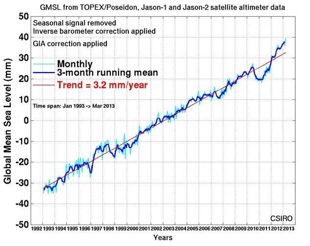
Study the graph below, which appeared in the September 2013 issue of National Geographic. Notice that the above (figure 1d.) satellite data, from 1992 onward, is used, but it is grafted onto tide gauge data. Note how it is asserted that this shows "clear acceleration." This is an obvious deception. We have seen that tide gauges show a linear rise, and that satellite data also show a linear rise but somewhat faster. But here they connect data from different sets onto the same graph and state that it shows acceleration! That's clearly an example of scientific fraud. It's not a hockey stick, it's a cue stick that was broken and glued back together! Unfortunately, this sort of data fudging is very typical of the way data are presented to us by people trying to prove that global warming is caused by man. The data from the satellite shows a faster rise, and they graft it onto tide gauge data, asserting that it shows acceleration, even though the tide gauge data after 1992 doesn't show any acceleration at all (see NY and SF data after 1992, on figures 1b. and 1c. or any other NOAA tide station ).
Figure 1e.
Below is a close-up showing the broken cue stick. Note how the slope suddenly changes in 1992 at the zero line where they shift from tide gauge data to satellite data:
Figure 1f. Close-up of above.
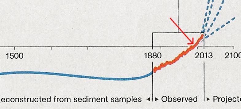
See also how they state that sea levels were not rising appreciably before the mid-1800's, but suddenly started to rise at that time "as the earth started to warm." But if the earth started to warm in the 19th century, and CO2 levels didn't rise until the 20th century, the CO2 rise obviously didn't cause the temperature rise. Because of this obvious fact, some people try to fabricate a more recent acceleration in the linear rise. The above cue stick trick is just one example of data fudging. We don't mean to pick on National Geographic for this fraudulent graph, it's part of the great "consensus" that use this exact same trick to claim sea level acceleration by grafting the satellite date onto tide gauge data as if this were acceptable science. But the scientific method says that all variables have to be kept equal, and combining different sets of data is anything but keeping variables equal. This goes against everything that the scientific method holds sacred. This is tantamount to an accountant using two sets of books, which would get him or her thrown in jail.
A 2011 paper by Church and White, peer reviewed and published in "Surveys in Geophysics," contains data which disputes this. That paper states that sea level rise accelerated in the 1800s, and has been linear ever since, but some people cite it incorrectly as saying that it is accelerating. The summary section of that paper doesn't state that sea level rise is linear, even though the facts presented in it show that it is, prompting some people to cite the paper as evidence that sea level rise is accelerating recently, even though the paper never says that.
The above data make it clear that sea level rise has been linear for over 150 years. Any statement that sea level rise is accelerating recently is wrong. But what's even worse, look at how sea levels suddenly rise in Figure 1e. starting in 2013 like a hockey stick in their future "predictions." This is obviously fraudulent and an attempt to sell more magazines using alarmism. Other deceivers have different motivations, but it seems that the common thread is that some people feel that fraudulent data can be used capriciously on what they consider to be a credulous public.
Figure 1g. (below) shows that humans didn't start producing much CO2 until the middle of the 20th century. How can this account for the linear rise in sea level which started 100 years earlier, and why does this recent enormous rise in CO2 not cause a synchronous acceleration of rise in sea levels in the 20th century? It's because CO2 has little to do with global warming.
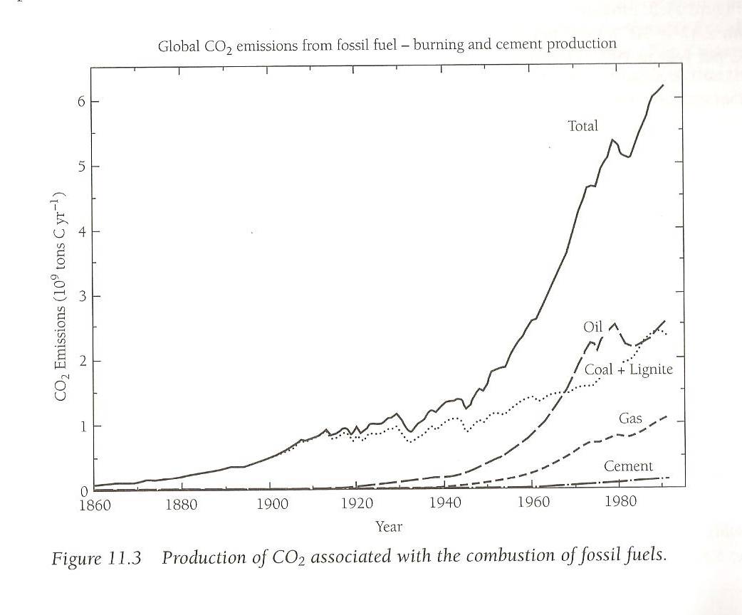
From Michael B. McElroy "The Atmospheric Environment" page 142. Princeton University Press c. 2002.
The arguments in this chapter show that the sea level rise of the past 160 years is linear and not caused by anthropogenic rise in CO2, which only came in the last 60 years. If the sea level rise was caused by warming at all, it started because of a natural warming that began around 1780 or earlier.
CHAPTER 2. CO2 RISE
Figure 2a. Carbon dioxide level during the last 550 million years. One can see from the chart that the current CO2 level is very low. Not long before humans arrived, it was the lowest in the history of the planet. If CO2 levels drop too low, life on earth cannot survive. Plant life depends on CO2, and animal life depends on plant life.
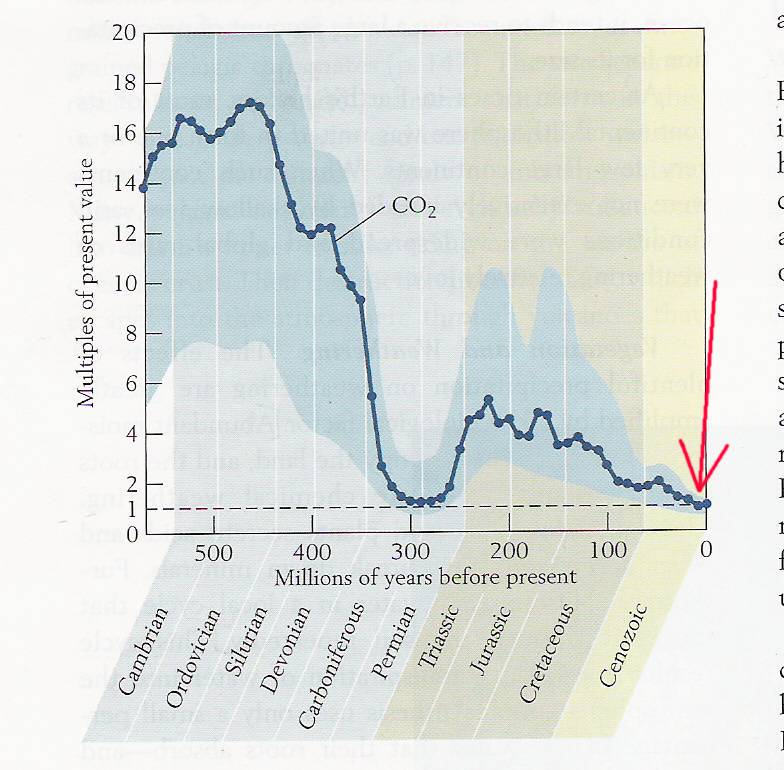
Copied from "Earth System History" by Steven M. Stanley (Johns Hopkins U.), W. H. Freeman & Co., New York, copyright 2009
Humans started burning coal in earnest in the late 19th century and petroleum in the early 20th. (see 1g. above). We have increased CO2 levels by 40% over pre-industrial levels, but still it is very low when compared to the time when mammals developed (the Cretaceous, 3 times today's level) and when dinosaurs lived (the Jurassic and Triassic, 5 times higher).
Figured 2b. (below) shows a similar graph, this one from "Ecology" by Peter Stiling, 2012 McGraw-Hill. The orange line shows the dropping CO2 level, and once again, it shows that the CO2 level, when humans first arrived, was the lowest in the history of the planet. Mya means million years ago.
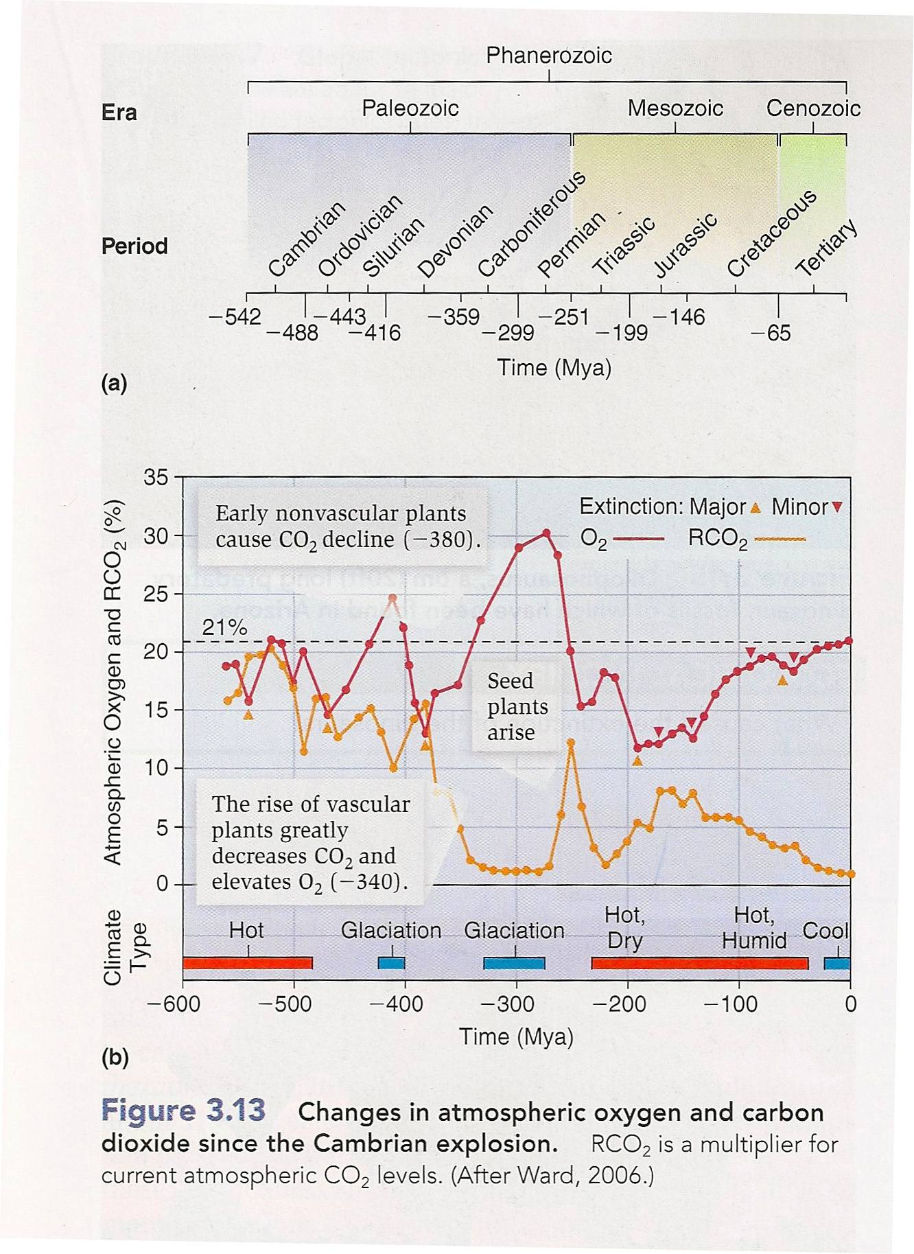
Some people contend that the CO2 level is higher than it's been in 800,000 years, (the red arrow in 2a.), and that we might soon reach a tipping point, without showing earlier levels that were much higher without a tipping point. Therefore, they only show charts starting in the last 800,000 years, hiding the earlier levels. This is deceptive on their parts.
CHAPTER 2B. THE ROLE OF CO2 IN THE GREENHOUSE EFFECT
In May, 2013, the CO2 level went over 400 ppm for the first time. Water vapor in the tropics can be up to 4% of the atmosphere by volume, which is 40,000 ppm. This means that water vapor in the tropics under these conditions is 100 times more abundant than CO2. And since each water molecule is 40% better at absorbing infrared than a CO2 molecule, because of the hydroxyl bond, that means water vapor is 140 times more important in this example as a greenhouse gas than CO2 in the tropics. But the tropics is where earth gets most of its sunlight for two reasons. First, the sunlight is stronger there, and secondly, the earth is much bigger at the equator and the tropics covers a much greater area. This demonstrates that CO2 is a trivial greenhouse gas.
The above is water in its vapor form only, and doesn't include clouds which
are liquid droplets which can convert to vapor at a moment's notice and add to
the greenhouse effect. CO2 can't do this.
Obviously, 4% is an extreme case, but 2% or 1%, which are typical clear-weather
levels in the tropics and normal summertime levels in temperate zones, show that
H2O is so overwhelmingly more
important than CO2 as a greenhouse gas that the latter is negligible
as such. Only in the winter in temperate zones, or all year in polar zones, is
the CO2 level in the same league as water vapor and even worthy of
mention as a greenhouse gas. However, the amount of sunlight under those
conditions is not a significant percentage of the total amount of
sunlight the earth receives annually, which mostly occurs in the tropics,
subtropics, or in the summertime in temperate zones. The only other place where
CO2 levels are in the same realm as H2O levels
is the upper atmosphere, where it doesn't matter. There is very little H
The scientific consensus is that pre-industrial levels of CO2 were 280 ppm, and that we have raised it by 120 ppm. to 400, and it is commonly held among scientists that in doing so, we have raised the temperature of the earth by 0.8
°C. The general understanding among most non-scientific proponents of AGW is that the more CO2 you add, the more greenhouse effect you will get, as if there were a linear relationship between the two. If this were true, it would mean 0.8°C for every 120 ppm. if the correlation is linear. Assuming it is, since the atmosphere currently has 400 ppm, that means 2.46°C are accounted for by CO2. In Michael McElroy's "The Atmospheric Environment" which is used as a textbook in many colleges, it states on page 59 that earth's greenhouse effect raises earth's surface from 255°K to 303°K, or 48°C. Of the 48 degrees of greenhouse effect, we have seen that 2.46 degrees were caused by CO2. A simple calculation shows that 2.46 out of 48 is around 5%, and if we add methane, NO2, fluorocarbons, and SO4, it brings it to around perhaps 6% or 7% for all the non-H2O greenhouse gases. Water vapor accounts for the other 93 or 94%.The above argument starts with the premise that CO2 actually caused the 0.8°C in warming. This premise was assumed to show that, even using the global warming proponents data and argument, CO2 is insignificant as a greenhouse gas. But, judging by the rising sea levels starting in the 19th century, before CO2 was being produced in quantity by humans, and that this rise has been linear since then, in spite of all the CO2 we have produced, it shows that even the increase of temperature by 0.8°C was probably not caused by CO2 in the first place, so our rule of thumb in the last paragraph doesn't hold. Whatever has been causing the earth to warm for the past 2 centuries, it's not CO2.
Raising the CO2 level will do almost nothing to the greenhouse effect.
The above argument also starts with the premise that increases in the greenhouse effect and increases in CO2 are linear, that is, equal amounts of raising CO2 will cause equal amounts of warming. This is not the case at all, as figures 2c. and 2d. will show. We will see how almost all of the CO2-mediated greenhouse effect was caused by the first very small amounts of CO2, and that increases in CO2 do almost nothing because the atmosphere is basically saturated (not an accurate term but often used) with CO2 as it applies to the greenhouse effect. This is because the atmosphere is already almost opaque to IR at the CO2 band, and you can't make anything more opaque than opaque.
Figure 2c. below, shows how most of the greenhouse effect that was caused by CO2 was caused by the first 20 ppm. By the time we get up to 100 or 200 ppm., that accounts for almost all of the greenhouse effect that is caused by CO2, and the amount of CO2 added by man so far, which brings it up to 400 ppm, has done very little, as you can clearly see from the graph. After 400 ppm., adding CO2 to the air has almost no effect at all, because of saturation. Even if we double current 2014 levels to 800 ppm, which might take centuries to do, the earth gets warmer by less than 0.4 C. (Look at the difference between 20 and 40 ppm, one doubling, to see how much one doubling is). Most importantly, we can clearly see there is no "tipping point," because the more CO2 we add, the less it does. The IPCC and other global warming activists say the rate is 3 degrees per doubling, but that's impossible as we will see.
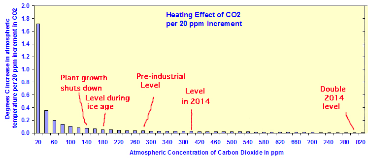
From http://wattsupwiththat.com/2010/03/08/the-logarithmic-effect-of-carbon-dioxide/
The numbers don't work if the climate sensitivity of CO2 (the increase in temperature per doubling) is 3 degrees per doubling. If it were, when it doubled from 200 to 400 ppm we would have gotten 3 degrees, from 100 to 200, 3 more degrees, from 50 to 100, 3 more, from 25 to 50, 12 to 25, 6 to 12, and 3 to 6, that's 7 doublings that all happened when CO2 was logarithmic, so from the past 7 doublings the earth would now be 21 C warmer thanks to CO2. But let's do a reality check. How much of earth's greenhouse effect is really due to CO2? The answer is 3 degrees, not 21. The total greenhouse effect is around 40° C and 90% of it is due to water vapor. Only 7% is due to CO2. And 7% of 40 is around 3, not 21. So climate sensitivity is really 0.4° C per doubling to get 3 degrees out of 7 doublings. That's why this chart is accurate, and the IPCC charts are totally wrong. Look at the chart, and find the bar at 40 ppm. The bar is around 0.375 degrees of warming. That's the increase in temperature from one doubling, from 20 to 40 pp. You can see that all the other doublings add up to the same amount. The climate sensitivity has to be this low to account for past logarithmic doublings.
From the above chart, we see that increasing CO2 to 800 ppm would only increase the temperature by .375 degrees. If we double it again to 1600 ppm, we increase it by another .375 degrees, but all that CO2 in the upper atmosphere would have a large cooling effect, since the top of the atmosphere (TOA) radiates IR to space. Since there is almost no water vapor at the top of the atmosphere, the only major IR active species up there are CO2 and ozone, so increasing CO2 cools the earth much more than it warms it. That is why the whole theory of catastrophic global warming by increasing CO2 is without merit. When we account for TOA cooling, increasing CO2 to such high levels wont even warm the earth at all, but cool it.
Figure 2d. shows what is meant by saturation. It shows how adding CO2 to the atmosphere decreases Earth's irradiance into space by blocking infrared. A decrease in irradiance at the top of Earth's atmosphere (the TOA), is evidence that the atmosphere is blocking those wavelengths from escaping into space, thereby heating Earth.
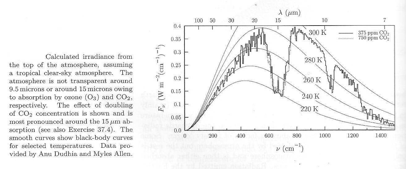
From Thermal Physics by Stephen and Katherine Blundell, 2010, Oxford University Press, p. 454
The TOA radiates mainly between 7 and 50 microns, which is the part of the spectrum associated with Earth's radiant temperature, but CO2 only absorbs in a band around 15 microns (675 waves per cm.). Because the atmosphere is already almost opaque in that band, adding more CO2 has little effect, and the figure shows exactly how much that effect is. In that 14-18 micron band, increasing CO2 from 375 to 750 ppm. increases the opacity by the amount shown by dotted lines. The dip in the curve caused by the first 375 ppm. is the solid line. The dotted line, which corresponds with the second 375 ppm. is minuscule by comparison. The first 375 ppm. causes a dip the size of Grand Canyon, and the second 375 ppm. is like somebody chipping along the sides of the canyon with a small pick. Outside that band, adding CO2 to the atmosphere does nothing at all. But it gets even worse...
One can see from the graph that at around 14 microns, and again at 16-18 microns, doubling of CO2 increases the blocking of radiation very slightly, causing warming, but if you look at around 15 microns, radiation of heat into space increases, which causes cooling. So, as trivial as the increased blocking of radiation along the sides of the CO2 band is by adding CO2 to the atmosphere, it is offset by a slight increase in radiation in the central part of that band. The temperature associated with 15 microns is much colder than the surface anywhere on Earth, so it corresponds with the TOA temperatures, which means this radiation is going into space. Any of this radiation aimed downward would be blocked by CO2 high up, and never reach the ground. In summary, some of the effect of doubling CO2 causes warming, and some causes cooling, but in either case the amount is trivial because the atmosphere is already almost opaque to infrared at the CO2 band.
This represents the increase in greenhouse effect if we raised the level to 750 ppm, which would take centuries to do and would only result if we burned every trace of fossil fuel reserves on the planet. So, as trivial as this increase in the greenhouse effect would be by raising CO2 to 750 ppm., it will probably never even happen.
According to climate physicist Murray L. Salby, in his "Physics of the Atmosphere and Climate," p. 248-9, the greenhouse effect over the past 2 centuries has been increased by 1.5 Wm-2 due to anthropogenic CO2. He continues that this "is about 0.5% of the 327 Wm-2 of overall downwelling LW radiation that warms the Earth's surface. The vast majority of that warming is contributed by water vapor. Together with cloud, it accounts for 98% of the greenhouse effect."
The arguments presented in this chapter make it clear that the greenhouse effect on earth is mediated almost entirely by water vapor, and the idea that the small amount of greenhouse effect caused by pre-industrial levels of CO2 will be increased by more than a negligible amount by adding more CO2 to the atmosphere is without merit.
Chapter 3. Global warming
Figure 3.
. 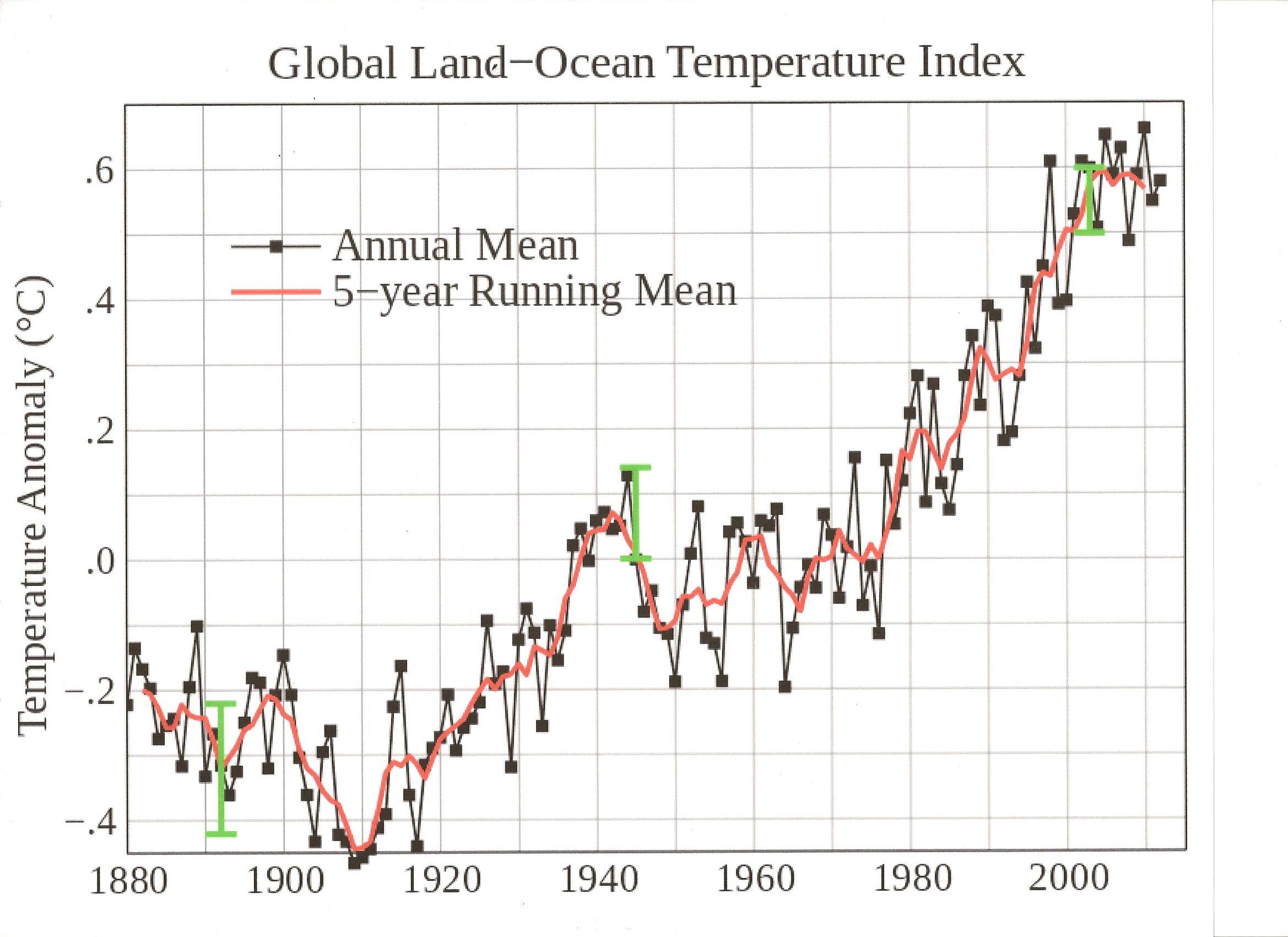
The above famous temperature chart was produced by NASA's GISS division and has been used and cited by hundreds of scientists in the consensus. We can see that between 1908 and 1942, global temperatures went up 0.5 degrees centigrade.
From 1942 to 1978 global temperatures decreased and rebounded, but in 1978, we start back where we were in 1942, at +0.06°C, and find that temperatures rose again sharply during the period 1978 to 2004. During those years it rose 0.54°C.
The 0.54°C rise from 1978 to 2004 was supposedly due to human generated CO2 from power plants, automobiles, and factories, as humans belched gigatons of CO2 into the atmosphere. The 0.5°C rise from 1908 to 1942 was due to the new Model T Ford. </sarcasm>
The Poles
What about the melting poles? They always show us pictures of polar bears and melting sea ice at the north pole. It turns out, the Arctic was warming for a while but has rebounded to earlier levels, and Antarctic sea ice is increasing. The following graph shows total global sea ice since 1979.
Figure 3a. Global sea ice has not changed in 26 years. Look at the red trend line at the bottom.
%20.jpg)
Courtesy University of Illinois Urbana-Champaign, see web address in screen grab.
There was a decrease in global sea ice from around 2004 to 2012, but it has now recovered to 1980 values. Every year the amount of sea ice reaches a maximum in December when the Antarctic sea ice melt exceeds Arctic freezing, and a minimum in February when the Antarctic sea ice is almost all melted and the Arctic is still freezing.
Global warming alarmists say Antarctic sea ice increases because of ice loss from continental glaciers, which freshens the ocean water. But this is impossible because ice loss from Antarctica's glaciers is only a few dozen gigatons a year, but the sea ice around Antarctica reaches a maximum of approximately 55,000 gigatons every year.
The global warming theory requires that warming starts at the poles, and since the poles are not warming, if both poles are taken together, that means the theory is a null hypothesis. But that won't stop alarmists from showing starving polar bears, instead of fat penguins. By the way, the polar bears are also fat.
Modern Warming
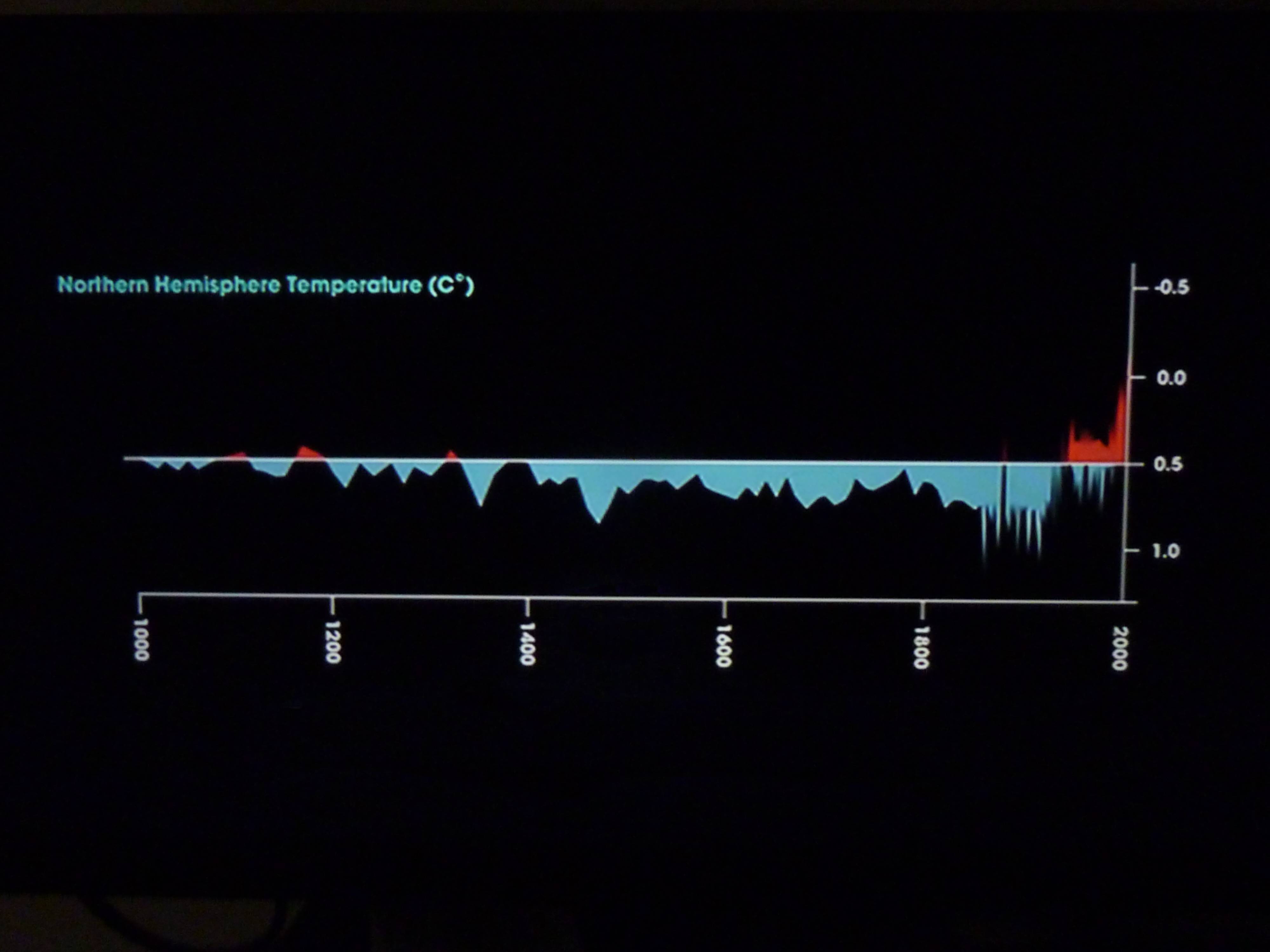
What about the hockey stick, the recent rise in global temperatures? Well yes, the earth's temperature is rising, but it started around 1780. Let's look at some data derived from ice cores taken in central Greenland, on the summit of an ice sheet 2 miles high (because the ice is 2 miles thick), in the study done by NOAA called GISP2 (Greenland Ice Sheet Project #2).
Water is made of hydrogen and oxygen, and we can measure the H and O isotopes in the ice at varying depths to tell us what the temperatures were in the past. The data are used as a "proxy," which means an event which can be used in place of thermometers. Many things are used as proxies, such as tree rings, pollen, dust, and sediment cores, but polar ice cores are the best because they are taken in places where there is very little weather, (no tornados, typhoons, floods), and very little other changes, (no biological influence, no changes from geology because it's 2 miles above solid ground), and it's far away from any human influence. Oxygen and hydrogen isotopes in the ice are analyzed to determine hemispheric temperatures because heavy water (water with deuterium instead of 1H), as well as heavy oxygen water, (water with 18O instead of 16O), have higher boiling points than regular water, and more heavy water gets into the atmosphere when global temperatures are high. The warmer the earth, the more heavy isotopes wind up in the ice. This has nothing to do with the temperature of the ice, it has to do with the temperatures at the evaporation sites.
Some argue that the Greenland proxy is local, and that the snow that freezes in Greenland arose in the Arctic, and so all the ice cores show us is polar temperatures, and some argue that the stratification of the isotopes in the ice cores results from fractioning during precipitation, so all they show us is the temperatures on Greenland Summit itself, but both of these points are wrong. Werner et. al., 2001 found that only 15% of Greenland Summit moisture comes from the Arctic Ocean. The rest comes from the following: 28% from the northern Atlantic, 15% from North America, 14% from the tropical Atlantic, 10% from the tropical Indopacific, 8% from the northern Pacific, 6% from Eurasia, and because this only adds up to 96%, the remaining 4% must come from the southern hemisphere, although it doesn't state that in the paper. But the Arctic Ocean doesn't count here, because it is full of ice and is therefore always the same temperature (in the same way that ice water in your glass is always 32 °F) and therefore, water vapor that arises from the Arctic Ocean would not be differentially fractioned in terms of isotopes and would have nothing to do with the isotope stratification in the ice core. The reason the stratification is due to differential evaporation at the source, not fractioning during precipitation, is found in Werner et. al., in the same paper, which states that a polar ice core "seems to be a surface temperature proxy" which means the surface temperature at the evaporative source, because "The strength of the deuterium excess signal is in general related to kinetic fractionation effects during evaporation, and can therefore be used as an indicator of changes in temperature and/or humidity at the evaporation site (Vimeux et. al. 1999, Johnson et. al., 1989)." Another reason the Greenland proxy is not local is, Antarctic proxies show similar results when there is no south polar ocean at all. A third reason is, during an ice age the Arctic Ocean is completely frozen over and covered with a mile of snow, yet ice core results from 30,000 years ago, during the depth of an ice age, show similar isotope stratification as during the Holocene when the Arctic Ocean has liquid surface water. Polar ice core proxies are, therefore, hemispheric. The Greenland ice core data, which is a proxy for the northern hemisphere, instead of Antarctic which is a proxy for southern, will be used for this analysis because most humans live up here. High resolution Antarctic ice core results showing Holocene temperatures in the Southern Hemisphere are seen in figure 3k.
The Greenland ice core data are from NOAA: http://www.ncdc.noaa.gov/paleo/metadata/noaa-icecore-2475.html
Looking at the data, it starts thousands of years ago and ends at a point that is .095 thousand years BP (95 years before present). This means 95 years before the geological "present" (by definition, geological present is January 1, 1950). This means 1855.
The horizontal axis on the charts below is the year, the vertical axis shows the proxy temperatures in central Greenland, in Celsius, as determined by the isotope signatures found in the cores. The temperature at the summit of Greenland is used on the chart because it is a known value that can be measured with a thermometer and calibrated in the lab to line up with isotope levels in precipitation measured there in modern times. Water vapor from the tropics moves to the poles through the stratosphere and upper troposphere, so local surface weather is not relevant, only hemispheric temperatures.
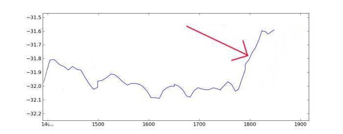
As we can see, the hockey stick starts around 1780, long before we started increasing the atmosphere's carbon dioxide levels. The data stops in 1855 because the snow above that level is too recent and not solidified, and is not usable in ice cores, but we know from figure 3 that the hockey stick goes through the 20th century as well.
Figure 3b. The red arrows points to the hockey stick from 1780 to 1855.
.
Figure 3c. goes back to 800 AD. We see the warm period around 1000 A.D., the Medieval Warm Period (MWP). This is when Greenland was settled by the Danes and Norwegians. They had to leave around 1400 and you can see why. They settled Iceland around 880 A.D. when it was becoming warm there. It looks like 1855 was much cooler than the MWP as well, but don't forget to add the modern century and a half, which is warmer. How much warmer? See below at figure 3i. and 3j.
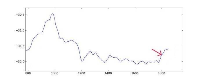
Figure 3d. goes back even further, to around 2,700 BC. Around 1,400 BC it was much warmer than even the MWP, or the modern hockey stick. Our modern temperatures, even with global warming, are colder than some of these peaks, which happened when the CO2 level was very low and nobody was burning anything but sticks.
.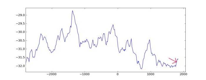
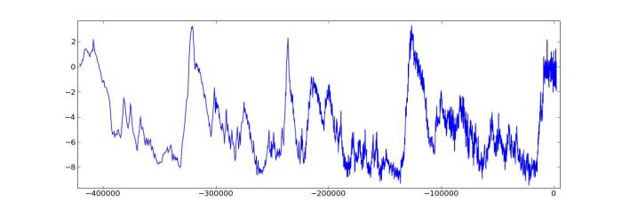
Figure 3f. goes back to 11,000 BC and and includes the entire Holocene. Look at some of the giant hockey sticks here, many of which are much bigger AND steeper than the global warming of today. All of this happened, however, when the CO2 level was much lower than today. We are getting into the last ice age. Look how cold it got back then, around 10,000 BC, and look how insignificant our little hockey stick is. It looks like the hockey stick, if it went a little higher, would bring us up to normal interglacial average Holocene temperatures. None of this has anything to do with man-made CO2.
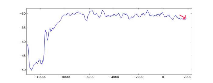
Figure 3g. This is when it starts to get scary. Remember how cold it got at 10,000 BC? It was like that for thousands of years before then. Canada and the northern US and Europe were buried under a mile of ice. Look how lucky we are today and how nice that hockey stick looks, warming us up a little. Feels nice, doesn't it?
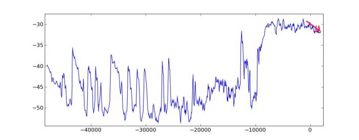
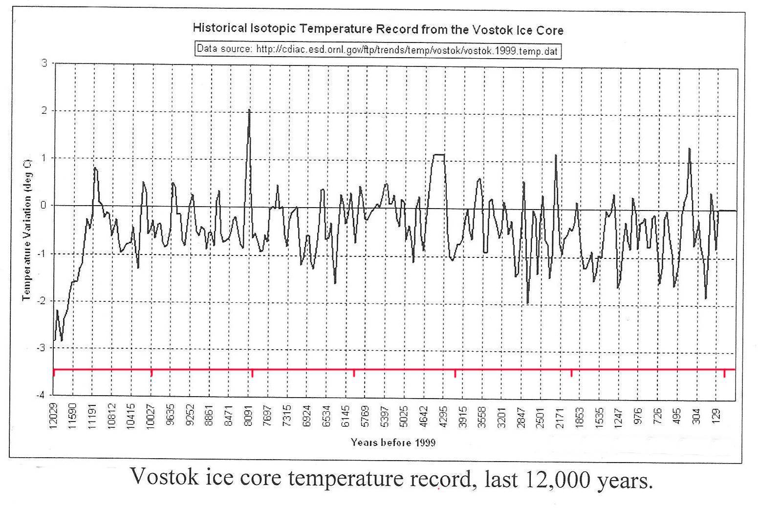
Figure 3h. is when is gets really scary. These data are from Vostok, Antarctica because Greenland ice doesn't go back this far in time. It shows the past several ice ages. It was warm 120,000 years ago, 230,000 years ago, 330,000 years ago, and 420,000 years ago. All the rest of the time it was ice ages. You can't see the hockey stick anymore but it's in the warm part on the right. The warm parts usually last only a few thousand years, and we are past the end of ours and living on borrowed time. Long live the hockey stick!
What about the years between 1855 and now? What was the temperature after 1855? Nobody was taking temperatures at the GISP2 site all this time. Luckily, there is a weather station only a few miles from there called the GRIP site, where people have been taking temperatures since 1840! The GRIP site is not as cold as the GISP2 site, so we can't just insert the data onto the chart. But we can simply find the difference between the 1855 GISP2 temperature of -31.6 and the decadal average for the 1850's at the GRIP site, which was -28.4, for a difference of 3.2 degrees. Now, we can add that number and plot the GRIP data right onto the GISP2 chart to get a modern hockey stick.
Figure 3i.
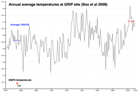
Figure 3j., shows what we did. We spliced the GRIP data (red) onto the
GISP2 data (blue) to bring us to the modern temp of -30.2 at the GISP2 site in Greenland
and -27.0 at the GRIP site. You can see that this hockey stick is nothing out of
the ordinary. The same amount and speed of increase in temperatures happened
many times during the past 10,000 years. Actually, every time before. This
modern hockey stick looks like it belongs here, and is perfectly normal. What is
certain is that it's not catastrophic in any way.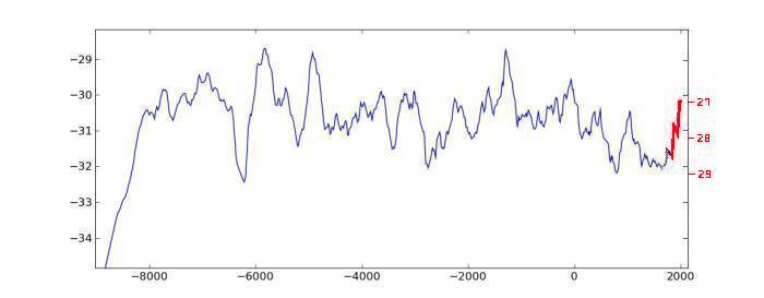
Figure 3k. Ice core results from the Southern Hemisphere proxy at Vostok,
Antarctica, showing only the past 12,000 years. Compare to figure 3f., which
shows the same time period using the Northern Hemisphere proxy at Greenland
Summit. Note that there is very little correlation between the two hemispheres,
showing that they operate somewhat independently. The only clear correlation is
that the Holocene started around 12,000 years ago in both hemispheres.What is
very clear from both hemispheres is that many times during the past 12,000
years, it has been warmer than our current temperatures, without any help from
fossil fuel combustion.
From "Global Warming, Alarmists, Skeptics, and Deniers" by
Robinson and Robinson, 2012, Moonshine Cove Publishing, Abbeville, SC.
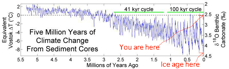
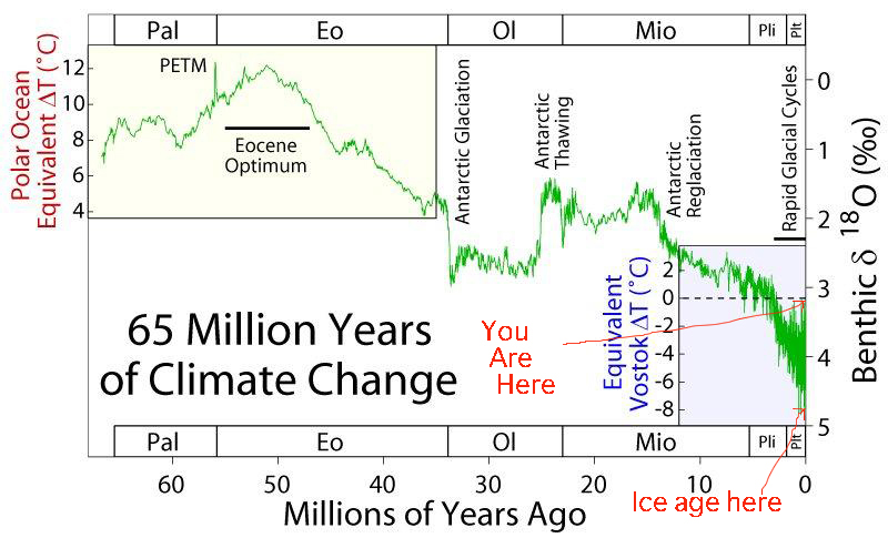
The ice cores only go back so far, down to the bottom of the ice shields. Is there a way to find global temperatures before then? Yes, and it's similar to the method used by the ice cores in that it takes advantage of oxygen isotopes, only backwards. When global temperatures are high, more water with the 18O isotope evaporates and forms our ice caps, fills our lakes, and soaks in as ground water, which means less of it remains in the oceans. During these times, the sediment that falls to the bottom of the ocean has less 18O in it. So, ice cores have more 18O in them when it's warm, and benthic sediment cores have less of it. Geologists have studied sediment cores for many years, and have given us graphs showing global temperatures going back millions of years.
Figures 3l. and 3m. show global temperatures for the past 3 million and 65 million years, respectively. They show us that, since the days of dinosaurs, global temperatures have always been warmer than they are now, except during ice ages.
Below is a photo of Vice President Gore disproving anthropogenic global warming, but he is too stupid to know it.
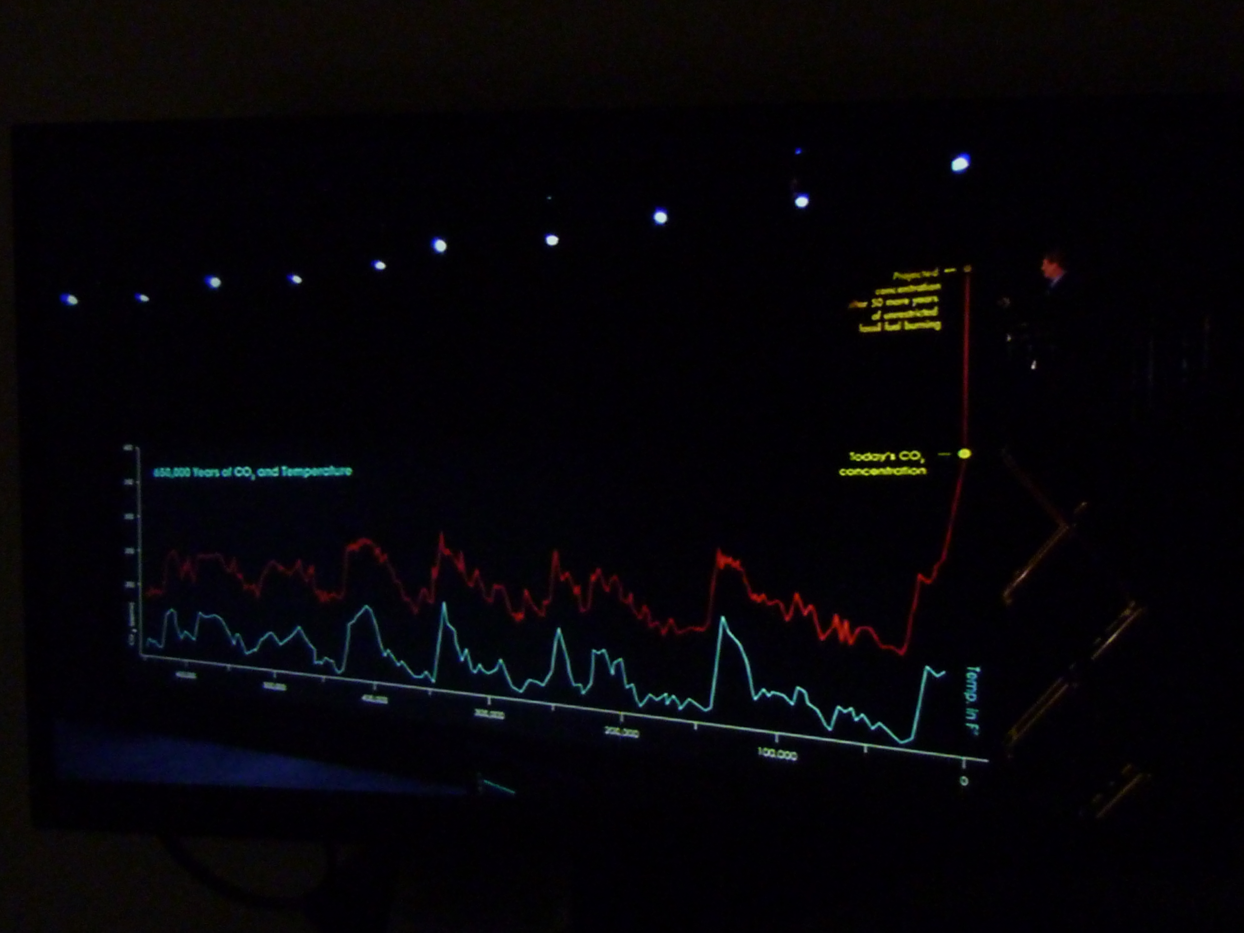
He is showing how CO2 correlates with temperature over the past several ice ages. The red line is CO2 and the blue is temperature, for the past 650,000 years. Al Gore is trying to show that CO2 causes warming. We already know, however, that the changes in blue precede the red. In other words, the changes in temperature cause CO2 to rise. (Warming of the earth causes CO2 to come out of the oceans.) VP Gore's antics of raising himself on a 20 foot high lift to show astronomically high CO2 levels, without a concomitant rise in temperature, only proves that he has no idea what he's talking about.
Let's get a better look at the chart he used, and see how CO2 lags behind warming.
CHAPTER 4. THE SUN
Let me just show you some pretty pictures. First, from "The Neglected Sun" by F. Vahrenholt and S. Lüning:
The next one shows increase and decrease of solar activity, from carbon 14 evidence. From Wikipedia. See there, or google it.
The next one shows solar irradiance since 1611. On the chart, the zig-zags are the 11-year solar cycles, but the long-term pattern shows that the sun's irradiance has increased by 3.3 W/m2 in the past 400 years, which is more than twice as much as the forcing due to anthropogenic CO2 as calculated by Salby above. I think the story is told right here, so it's time to end this paper. Turns out, it's the sun, stupid.
From "Global Warming, Alarmists, Skeptics, and Deniers" by
Robinson and Robinson, 2012, Moonshine Cove Publishing, Abbeville, SC.
One of the most common claims made by the global warming activists is that the
warming from 1908 to 1942 was caused by the sun, but that the warming from 1978
to 2000 was caused by anthropogenic carbon dioxide, but one look at the above
graph shows that their claim is without merit. In fact, the sun is the cause of
all warming for the past 200 years.
SUMMARY
In chapter 1, we found out how they lied to us about sea levels. In chapter 2, we learned how they lied to us about CO2. In chapter 3, we discovered that global warming is happening, but what they tell us about it is all lies. In chapter 4, we learned about the sun.
It's clear that AGW was just a fad, like Beatlemania. This fad lasted from the early 1980's until around 2009, when the fraud was fully exposed, and more fraud is being exposed daily. It's time to put it to bed. Global warming is dead. Only the most hard-core alarmists, with the most invested, are still holding onto the hoax.
APPENDIX. Stupid things global warming alarmists say
1."The villagers depend on the glacier melt water, and when the glacier is gone they will all die of thirst."
Why it's stupid:
Water doesn't come from glaciers. It comes from precipitation. If there was enough precipitation up there to make a glacier, there will be enough precipitation up there to keep the river running. Billions of people live where the only water to drink comes from creeks and rivers where there are no melting glaciers upstream, stupid.
2. "The CO2 level will reach a tipping point where a feedback will cause runaway increase in CO2 until Earth is like Venus."
Why it's stupid:
Earth has .04% CO2. Venus has 99% CO2. And Venus' atmosphere is 90 times denser than ours. And Venus is half as far from the sun as we are. Comparing Earth to Venus is like comparing a candle to a blast furnace, stupid.
Another reason why it's stupid:
Mars also has an atmosphere that is over 90% CO2, yet nobody ever compared Earth to Mars.
3. "You work for ExxonMobil and watch Fox News, and you are funded by the Koch brothers."
Why it's stupid:
I don't work for ExxonMobil, and I don't watch Fox News, stupid. And who the hell are the Koch brothers?
4. "97% of the scientists are in consensus so it's true."
Why it's stupid:
Like any other political party, the global warming party only allows like-minded people to join. That party is currently in charge of the media, the schools, the presidency, and the IPCC. People who disagree with them get fired and blacklisted. Saying that 97% of its members agree with each other means nothing. Science is not a democracy, stupid.
5a. "The reason sea ice near Antarctica is increasing every winter is because water is melting off the land and hitting the ocean, where it freezes."
Why it's stupid:
The ocean water off the coast of Antarctica is colder than the land itself? Ice never melts in Antarctica in the winter. How is it possible for anybody to be this stupid?
Another reason why it's stupid:
Climate experts say 68 or 83 or even 124 gigatons of ice are melting every year from the ice shelves around the edges of Antarctica, which freshen the ocean water and allows sea ice to increase around Antarctica. But high school math tells us that if there are 18 million square kilometers of sea ice 3 meters thick around Antarctica in the winter, we get 54 trillion cubic meters, or 54,000 gigatonnes. If you think you can get 54,000 gigatonnes of winter sea ice from 68 or 83 or even 124 gigatons of summer meltwater, you have to be very stupid.
5b. "The reason sea ice near Antarctica is increasing every winter is because of thermohaline stratification of the Southern Ocean due to global warming. Zinlun Zhang, 2006, says "an increase in surface air temperature and downward longwave radiation results in an increase in the upper-ocean temperature and a decrease in sea ice growth, leading to a decrease in salt rejection from ice, in the upper-ocean salinity, and in the upper-ocean density. The reduced salt rejection and upper-ocean density and the enhanced thermohaline stratification tend to suppress convective overturning, leading to a decrease in the upward ocean heat transport and the ocean heat flux available to melt sea ice. The ice melting from ocean heat flux decreases faster than the ice growth does in the weakly stratified Southern Ocean, leading to an increase in the net ice production and hence an increase in sea ice mass."
Why it's stupid:
A decrease in sea ice leads to an increase in sea ice? I guess it's possible for somebody to be as stupid as 5a. above.
5c. "The reason sea ice near Antarctica is increasing every winter is because global warming is increasing rainfall in the Southern Ocean, and rain is fresh water so it freezes."
Why it's stupid:
The sea ice is 10 feet thick. To make 10 feet of ice, you need 10 feet of rain, which is impossible, stupid.
5d. "The reason sea ice near Antarctica is increasing every winter is because of the hole in the ozone layer, making the Antarctic colder because ozone is a greenhouse gas."
Why it's stupid:
Lack of ozone makes it colder, but these other explanations assume it's warmer. You can't make it colder and warmer.
5e. "The reason sea ice near Antarctica is increasing every winter is because of the wind. The polar winds from the continent are getting stronger, because of global warming."
Why it's stupid:
In 5a. we learned that the land was warmer than the sea. Now we find out that the wind coming off the land is colder than the sea. I wonder why all that cold polar wind doesn't cool the land and stop ice from melting in the winter. Wow, you really ARE stupider than a rock...a very dumb rock.
5f. "The reason sea ice near Antarctica is increasing every winter is because blah blah blah........"
Why it's stupid:
If you need to make up this many reasons for something, you are lying.
|
A complete list of reasons (excuses) for the increase in Antarctic sea ice can be found here, in a paragraph near the end of this pee-reviewed* paper: http://www.the-cryosphere.net/8/1289/2014/tc-8-1289-2014.pdf Let us summarize their list of reasons: 1. ozone hole We think it's really caused by: 9. cooling * we used this paper to housebreak our puppy and she refused to go. The paper failed pee review. |
6. "Water vapor doesn't count as a greenhouse gas because it's a liquid and it doesn't stay in the atmosphere long before precipitating out. CO2 is by far the most important greenhouse gas because it's a gas and not a liquid."
Why it's stupid:
This is not only stupid, it's an outright lie. Nobody cares about the
liquid or the precipitation, all we care about is the water vapor in the air.
The alarmists know that water vapor is so much more abundant than CO2
and so much more important as a greenhouse gas that they have to hide it or
downplay it, because it
blows their whole theory out of the water, and it doesn't hold water anyway.
They're all wet.
The real reason CO2 is an
important greenhouse gas is because of the 7 doublings between 3 and 400 ppm.
The one doubling from 400 to 800 ppm, which wont happen for a century, is not
important.
7. "Every year over 3000 weather stations in America break their all-time heat records!"
Why it's stupid:
You can't makes statistical statements like this without something to compare it to. How many all-time cold records are broken each day? How many weather stations are there? 3000 out of 5000 would be a lot, but 3000 out of 3 million isn't. How many all-time heat records would be broken if there were no climate change? How many all-time heat records would be broken if the climate were cooling? Statements like this are not science, they are propaganda.
8. "Water vapor is a feedback, not a forcing. The more greenhouse effect we get from CO2, the more water vapor can remain in the air, which magnifies the greenhouse effect of CO2, the main greenhouse gas."
Why it's stupid:
Water vapor is a forcing, stupid. It's tens of times more of a forcing than CO2. And you are a miserable, pathetic liar for saying it isn't. It's also a feedback. It's also got latent heat. One thing it doesn't have is saturation. That's what CO2 has, you idiot.
9. "The global cooling scare of the 1970s never happened, it's just a myth that deniers made up."
Why it's stupid:
Because people can read. Every piano bench and hat box in America's attics is full of old magazines and newspapers. We've all read them.
10. "The ice melting in the Arctic decreases the albedo. Ice reflects sunlight, and melted snow exposes open water and causes the Arctic sunlight to be absorbed."
Why it's stupid:
Sunlight in the Arctic? What sunlight in the Arctic? It's dark 6 months a year and even at the summer solstice the sun only rises 23 degrees angle.
11. "You cherry-pick your data."
Why it's stupid:
Alarmists fudge, falsify, hide, and lie about their data, AND cherry pick. Showing the northern hemisphere only is cherry picking. Showing the north pole and not the south pole is cherry picking. Talking about 4 drowned polar bears is cherry picking. Hiding the sea level rise of the 1800s is cherry picking. Ignoring global warming before WWII, especially the large amount between 1908 and 1942, is cherry picking. The list goes on and on.
12. "You deniers are like the tobacco companies who denied that cigarettes cause cancer."
Why it's stupid:
Because tobacco causes cancer. CO2 is totally harmless to humans and Earth.
13. "Hurricane Sandy was caused by climate change."
Why it's stupid:
Sandy hit the coast at high tide. The daily tides in New Jersey and New York are around 5 feet and the storm surge of Sandy was 13 feet, which adds up to 18 feet. The sea level has risen by around 9 inches over the past 100 years on the east coast. The damage was caused by the 18 feet in a few hours, not the 9 inches in 100 years.
14. "Hurricane Katrina was caused by climate change."
Why it's stupid:
Katrina was so destructive because it hit a major city. Hurricanes cause more damage when they hit major cities, than when they miss major cities.
15. Below is a graph that Al Gore has in his movie that proves global warming is not anthropogenic, but he doesn't know it.
Why it's stupid:
In the graph, we see that the temperatures never went into the red between the mid-1300s and the 1800's, and then you see one blip in the red around 1870 or so. We weren't burning any petroleum in 1870 and very little coal. Then around 1900 it rises quickly. But the CO2 levels were the same in 1900 as the pre-industrial level, so whatever is causing the warming, it's not CO2. Look at figure 1g. to see how little CO2 we had made in 1870 and 1900. None!
16. "The science is settled. I don't argue with deniers because it's settled."
Why it's stupid:
Politicians are not qualified to argue the science, so they hire scientists who agree with them, pay those scientists to write papers with the results they want, and fire those who don't. Once all the scientists who disagree with them are fired and on the black list, the science is settled.
17. "Humans spew 8 gigatons of carbon into the atmosphere every year."
Why it's stupid:
Giga is billion and billion is a big number, and big enough to alarm. And what alarmists want to do is alarm. Stupid point number 7 above gives an example of giving us alarming-sounding numbers without anything to compare it to. A gigaton is a lot, but is this a large number when talking about the atmosphere? No, it's a small one. The amount of water vapor in the atmosphere is measured in teratons, and the total atmosphere is measured in petatons. One gigaton is nothing, stupid.
Another reason why it's stupid:
Did you ever notice that global warming alarmists always say "carbon" instead of carbon dioxide? The reason they do this is calculated. It's because people know that carbon is soot, and therefore dirty, as opposed to carbon dioxide which is an odorless invisible gas. It's public relations and propaganda. Carbon dioxide is perfectly harmless and belongs in the atmosphere, you moron.
18. "You are anti-science."
Why it's stupid:
Climate science is a branch of environmental science, which is a branch of political science, which is a branch of social science, which is a branch of liberal arts, which is a branch of bullshit artists. We are not anti-science, we are anti-artists. Get it right.
19. "The sun doesn't vary in its output by more than 0.1% either way, which isn't enough to explain global warming."
Why it's stupid:
If we take the 0.1% figure, knowing that the sun heats the earth by about 300K, and do basic arithmetic, we find that 0.1% of 300 is 0.3°, and since that is "in either direction" it comes out to 0.6 °C from max to min. But 0.6 °C explains global warming, stupid.
20. "Greenland ice cores are only a local proxy of temperature."
Why it's stupid:
Isotope concentrations in ice cores are a proxy of the temperatures at the evaporation site. There is no evaporation on the Greenland Summit because it is always frozen. Any evaporation (sublimation) on the Summit would ruin the annual layers found in the ice. Basically, none of the moisture that freezes at the Greenland Summit comes from the Greenland Summit. It's the opposite of a local proxy. It's an "everywhere but local" proxy, stupid.
21. "Carbon dioxide is the main greenhouse gas."
Why it's stupid:
According to Murray L. Salby's "Physics of the Atmosphere and Climate," p. 248-9, the greenhouse effect over the past 2 centuries has been increased by 1.5 Wm-2 due to CO2. He continues that this "is about 0.5% of the 327 Wm-2 of overall downwelling LW radiation that warms the Earth's surface. The vast majority of that warming is contributed by water vapor. Together with cloud, it accounts for 98% of the greenhouse effect." Kind of makes you feel stupid, doesn't it?
22. "Glaciers are melting all over the world due to human carbon emissions."
Why it's stupid:
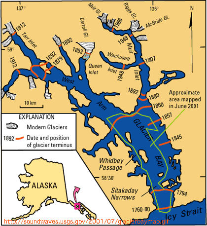
Glaciers have been melting for 250 years, when
Earth came out of the Little Ice Age. Human carbon emissions didn't start
building up until the 20th century. Here's a map by the USGS of Glacier Bay,
Alaska. Note that in 1760, Glacier Bay had no bay, just a glacier. Humans had
nothing to do with melting these glaciers, stupid.
23. "Global warming will cause crops to fail, farm
production will decrease by (insert bogus number here) percent per year."
Why it's stupid:
Longer growing seasons, fewer killing frosts at night, and added CO2, is good for plants. This point is utterly without merit.
24. "You say global warming started over 200 years ago. Yeah, the Industrial Revolution began in the 1700's!"
Why it's stupid:
The Industrial Revolution in the 1700's didn't do anything to CO2 levels, which didn't start changing until the middle of the 1900's. Take another look at figure 1g., stupid.
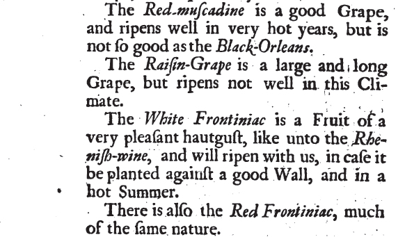
25. "The Little Ice Age" was local to Greenland only. The myth that grapes didn't ripen in England in the 1600's is a lie that deniers made up, they had plenty of vineyards in medieval England."
Why it's stupid:
From Vinetum Britannicum, written in 1676, in England:
:
26. "Conspiracy theory, talking points, 97%, etc, etc."
Why it's stupid:
These phrases are part of a new vocabulary invented by AGW alarmists, a sort of shibboleth that has developed. A handful of propagandists have set the standard, and they follow blindly. A sure sign of brainwashing is when the people with washed brains use slogans, phrases that are not part of the normal vocabulary. There is no such thing as a conspiracy theory. A theory? How is that a theory? Somebody in the AGW camp invented that phrase and the parrots repeat it. Talking points? What's that? One thing for sure, they are all full of shibboleth.
27. "Warming didn't stop, 7 of the past 12 warmest years have all been in the past decade."
Why it's stupid:
I stopped growing around 1974. All 40 of my tallest years have been in the past 40 years. That means I'm still growing?
28. "CO2 is not good for plants. It causes weeds to grow faster which chokes out the crops. All the good plants, such as trees and flowers, will not grow any faster because of CO2, but all the bad plants, such as ragweed and poison ivy, will. Besides, global warming will cause drought all over the world and harm all the plants. That is, all the plants other than the bad plants."
Why it's stupid:
There is no need to explain how stupid this is. For a good laugh, google global warming poison ivy. These morons expect us to believe that carbon dioxide has caused poison ivy to mutate into a more potent strain. They think we are stupid, but that's what propaganda is all about, isn't it?
29. "All this CO2 is increasing asthma and heart disease."
Why it's stupid:
The CO2 is currently 400 ppm outdoors. Indoor levels with windows closed are typically 1000 or 2000 ppm, in a crowded area such as a nightclub or bagel shop, it can be 5000 ppm or more. People don't usually feel as if the air is stuffy until around 10,000 ppm, when it may trigger an asthma attack for people subject to them.
APPENDIX #2
WHY ANTHROPOGENIC GLOBAL WARMING (AGW) IS WRONG - A concise list of reasons
We cannot disprove AGW by making fun of Al Gore, proving fraud in Mann or Jones, questioning the motives of political activists, or disputing the computer models. It's possible for these to be wrong and AGW to still be true. We must give actual reasons why the science is wrong. Here is a summary of the reasons:
1. Global warming started around 1800 when CO2 levels were unchanged from pre-industrial. Most of it occurred before 1942. Glaciers have been melting since the early 1800's as this article from 1910 shows: http://trove.nla.gov.au/ndp/del/article/100784966 and they aren't melting any faster now than they were then.
2. Sea level rise also started in the early 1800's, 100 years before CO2 levels started to change, and it has not accelerated since then, as shown by all tide gauges. If sea level rise were accelerating, it would show on every tide gauge in the world. It shows on none.
3. Ice core data shows that CO2 rise always lags behind warming, so warming drives CO2 rise, not the other way around. One can argue that in the past, the warming may have driven CO2 rise and that modern warming is different, but this argument falls apart when we see no greater warming in the last half of the 20th century when compared to the first half. That means, there should definitely be much faster warming from 1950 to 2000, than there was 1900 to 1950. But it's the same rate.
4. Warming should start at the poles, but it isn't. The south pole was getting colder until recently, and has now leveled off, but it has never warmed, and even though the north pole is warming, it still is not as warm as it was in the 1930's and 1940's, or even the 1950s. See studies by Rajmund Przybylak of Poland and Igor Polyakov of Alaska. See figure 3a. above, showing global sea ice. In spite of all the lies we are told about why Antarctic sea ice in increasing, the truth is that it's increasing because the Southern Ocean is cooling. No change in global sea ice since 1980! If the poles are not warming, the globe isn't either.
5. The urban heat island effect (UHI) is huge and is never figured into any of the global temperature calculations done by NASA, GISS or NOAA, or in the IPCC reports. Many of these weather stations are in places where urbanization has occurred. What may have been a cornfield in 1920 may be an asphalt parking lot today. The UHI effect is enormous, much more than the 0.8 °C of warming the charts show, and yet the charts don't adjust for it at all. This tells us there may not even be any global warming at all.
6. Figure 2c. shows us that any greenhouse effect caused by CO2 was caused by the first small amounts of it, before man, leading to the atmosphere becoming almost opaque to infrared at the CO2 band. Any increase in greenhouse effect caused by increases in CO2 is trivial to negligible.
7. Modern warming happened in 3 steps. One, a 0.4 °C rise from 1800 to mid-1800s, then a 0.5 °C rise from 1908 to 1942, and then a 0.54 °C rise from 1974 to 2003. Neither of the first two had anything to do with CO2, and there is no reason to think the third one had much to do with it either.
8. One of the most damning signs that this is a hoax is the warmists themselves and their reactions to positive information. When an event gives evidence that there is no catastrophic global warming, does it make them rejoice? No, it makes them nervous. It makes them look for new lies to explain why it's not really a sign. They say the 18-year pause isn't real, Antarctic sea ice is caused by warming, the polar vortex is caused by warming, the 100% failure rate of their computer models is not a problem. Nothing makes them happy, nothing makes them admit they are wrong.
9. Look at stupid point 19 above, where the solar output varies by 0.1% from max to min. Even if the figures are just guesstimates, we need not look any further for the cause.
10. Proof that they are full of shit: You'd think the alarmists would be happy when something shows that maybe the world will be ok after all....something like the warming hiatus or the rebounding of Arctic ice. But it doesn't. Trenberth calls it a travesty. What makes them happy is something like Hurricane Sandy, because it caused so much destruction and dislocated millions of people. This is what they cheer about.
(List under construction)
| GLOBAL WARMING IS WRONG |
|
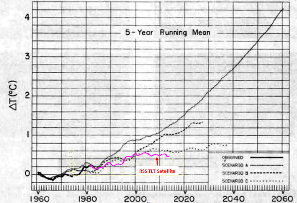
Most climate activists agree that it will be Scenario A...extreme warming, if we keep using fossil fuels the way we do, Scenario B, moderate warming, if we cut them drastically, and Scenario C if we suddenly stop using them entirely and stop making CO2 completely. It turns out, the 3% of scientists were correct. We got Scenario D.....no warming whatsoever while making more CO2 than we ever dreamed of. This means they are wrong. |
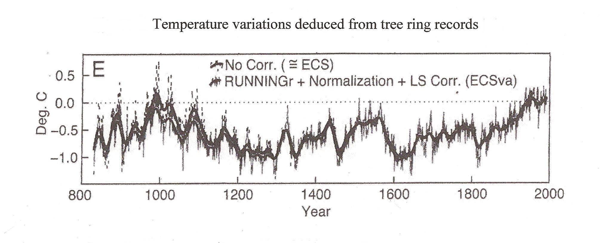
The chart below shows that modern warming started around 1810, long before humans did anything to the CO2.
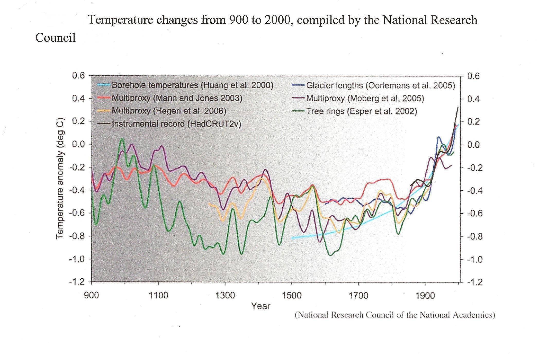
This next chart shows 6 different temperature proxies or reconstructions along with the instrument record. All 6 of them show that modern warming started in the 1800's. Four of them show a sudden rise that started around 1810 or 1820 and the other 2 don't disagree with them either. One of these reconstructions was even done by Michael Mann of hockey stick fame. The fact that global warming started over 100 years before humans did anything to CO2 shows unequivocally that humans did not cause it, and that the people who say we did are spreading a myth, a legend, a fraud, a hoax, and party politics as usual.
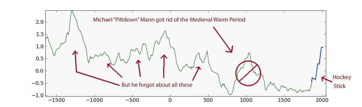
The next one shows that there have been many periods of global warming during the past 3500 years. The steepness of rise during many of theses warm periods was faster than modern warming, and some of them were much bigger. Actually, it shows that the Little Ice Age was the problem, not modern warming, and that all that is happening now is temperatures are coming back to where they belong.
GISP2 data in °C with
0 = -31.22
GRIP data in °C
adjusted so 1855 is the same as GISP2 on the y axis